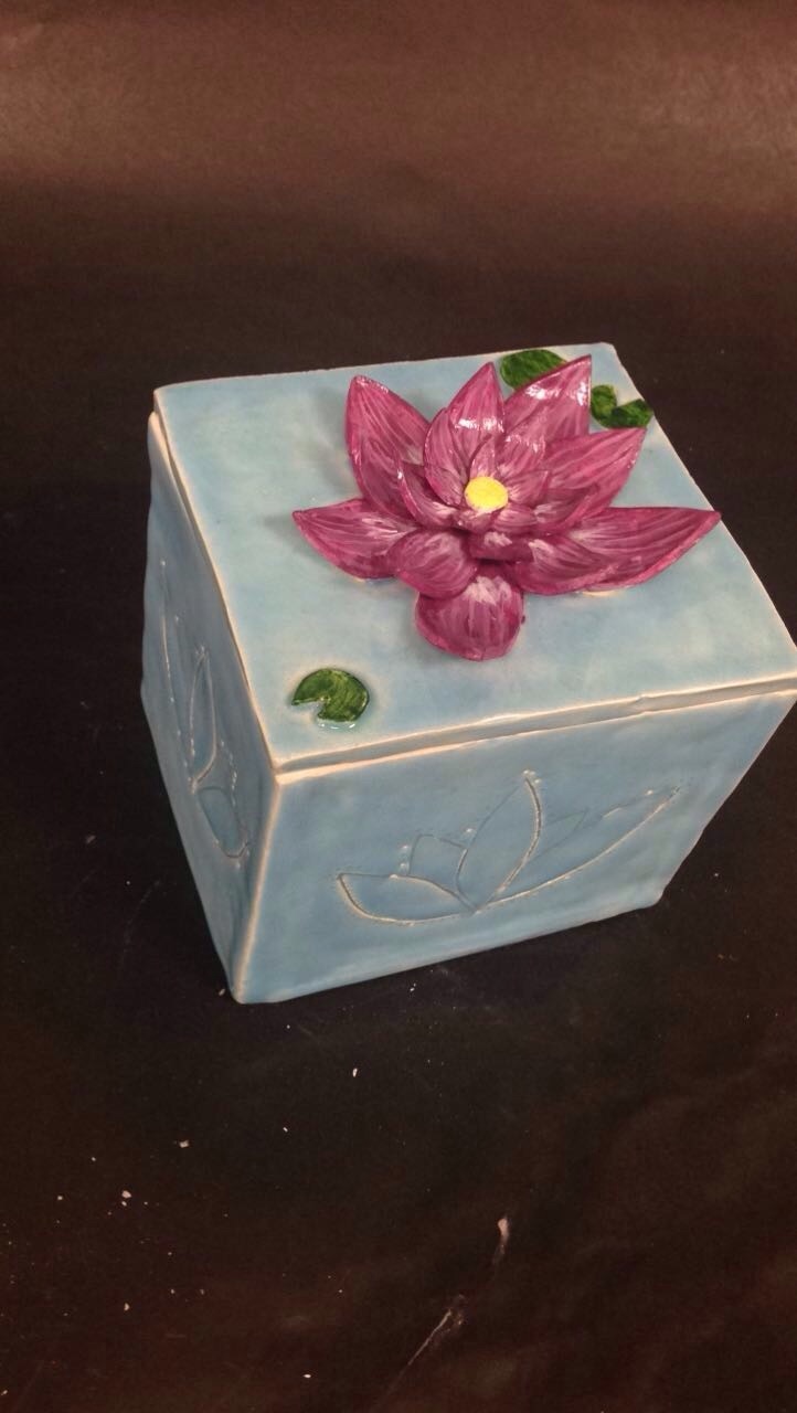
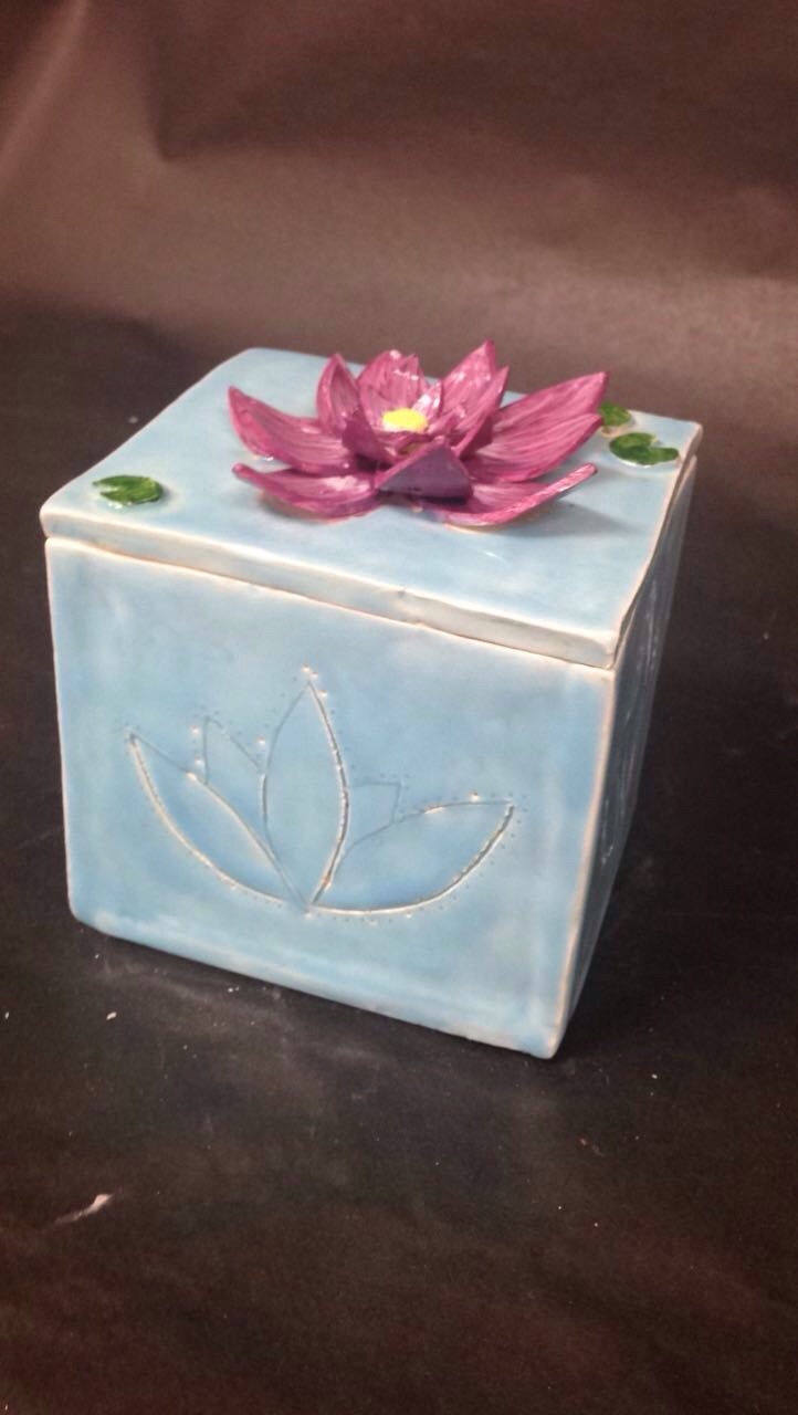
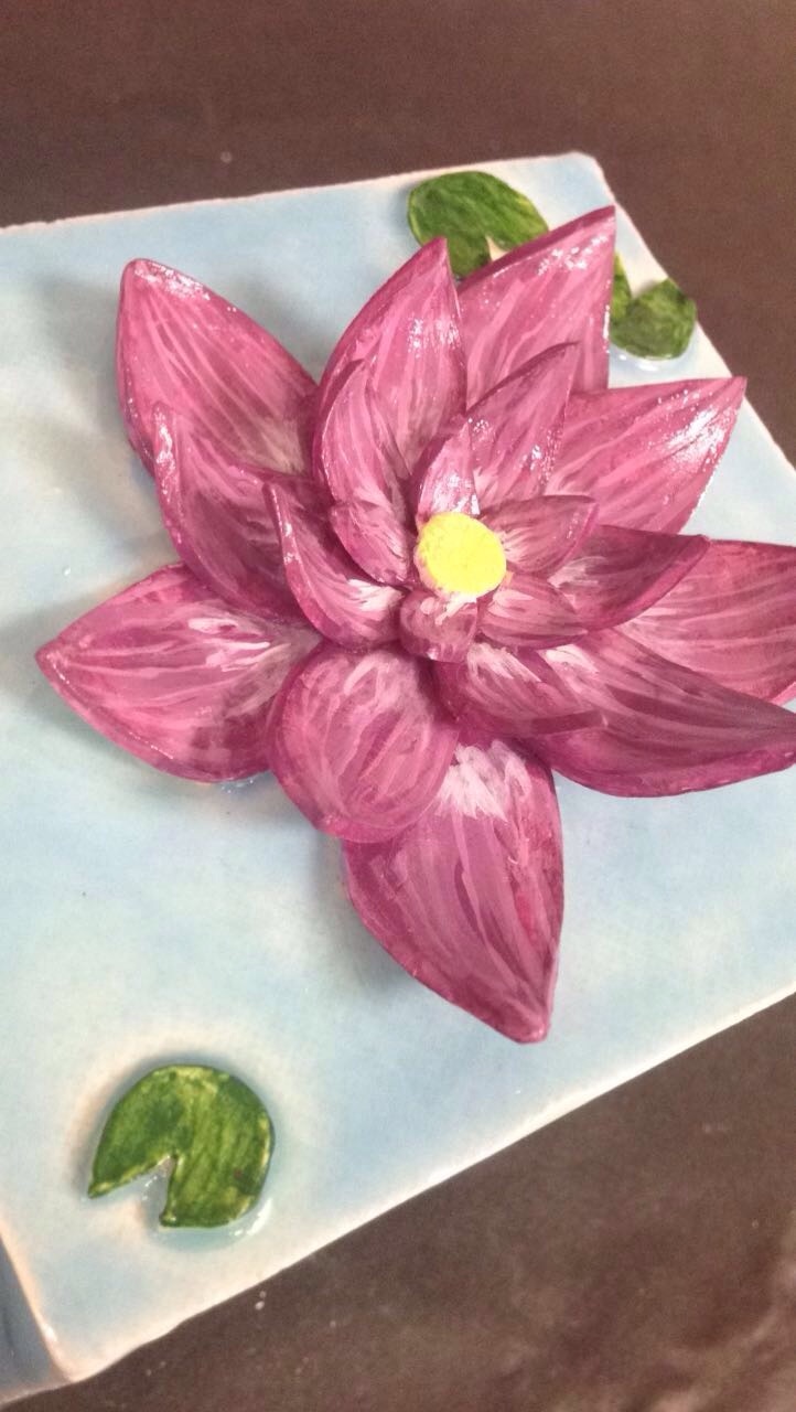
   1.) Since completing the in-progress blogpost, I have added a layer of light blue glaze to represent the water and have also painted the Lilly pads and the lotus flower with acrylic paint. To seal the newly painted detailed, I glazed it and then it was finished.
2.) I think the most successful part of my box is how realistic the flower on top is. I spent a lot of time on the highlights and textures of the flower's petals and I think in the end, it payed off because the colours are right and it looks just how I envisioned it. 3.) If I were to do it again, I would have glazed over with the light blue just a couple more times because there are some parts in the carvings on the side where it is not completely glazed but other than that I am very proud of this piece.
0 Comments
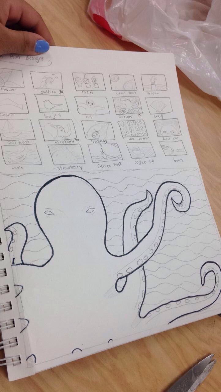 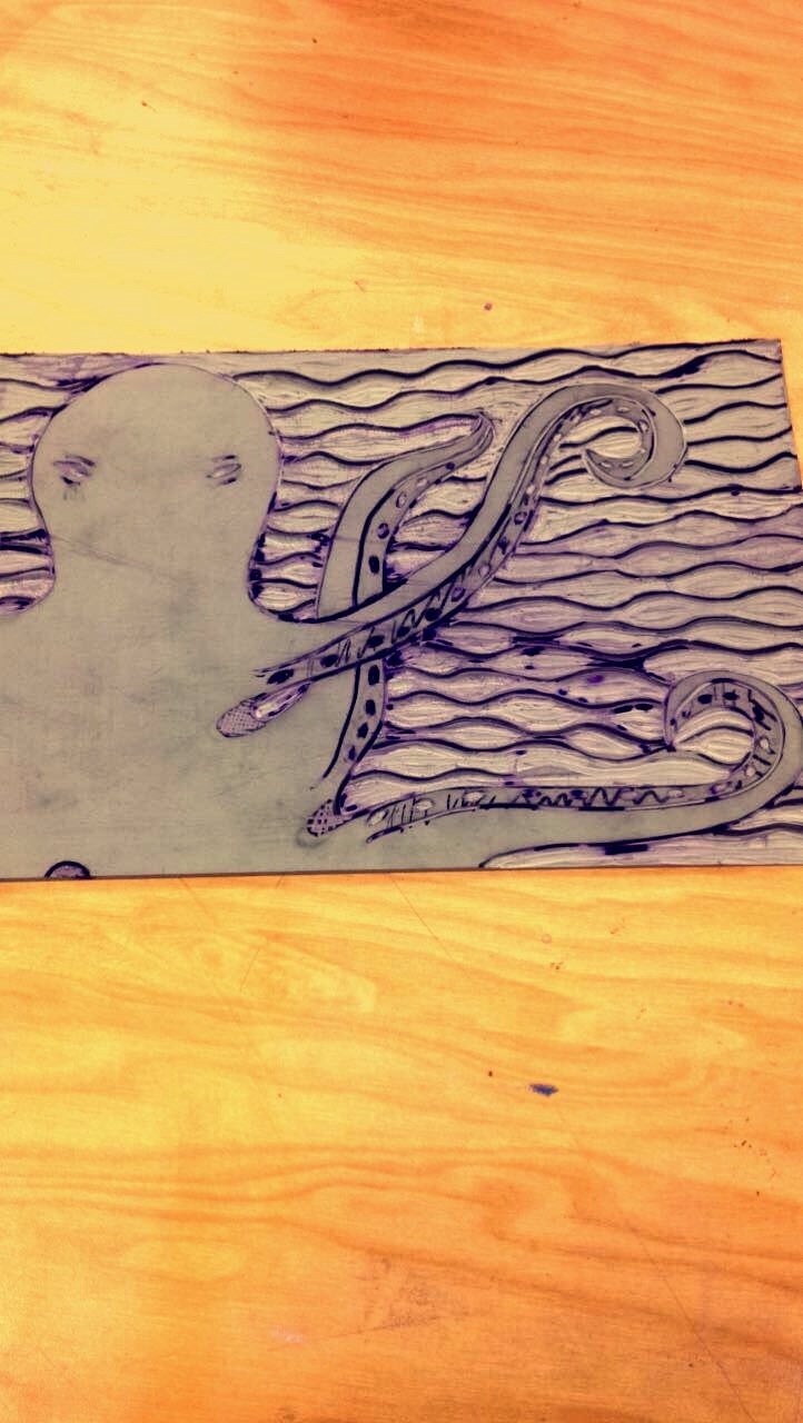 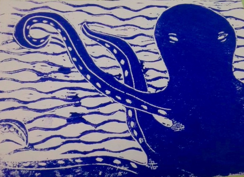 1.) My piece shows off the theme of 'line' because I used it to make a wavy background to symbolize water in this piece.
2.) I think my piece is successful in making you feel like your underwater and actually observing the octopus. I personally get Pirates of the Caribbean vibes off of it. If I where to make some changes, I would have made the lines the part I cut out not around it. Also, I would have been more conscious of how deep I was cutting because sometimes, the print was not as vibrant as I would have liked it to be. |
AuthorFifteen years old and an art student at Apex High School. Archives
June 2017
Categories |
 RSS Feed
